top of page
SILVERS CREEN CINEMAS
2023
BACKGROUND
This project was an exercise in using a premade design system and client-approved assets to create a prototype within hypothetical brand guidelines.
CONCEPT
"Silver Screen Cinemas" was a hypothetical brand presented to us as a mock client looking to have an application made to handle ticketing and scheduling transactions. Increasingly, movie goers rely on digital ways to obtain tickets and plan viewings, rather than in person. Applications like these have become common as real-world brands and theater chains have taken steps to adapt to this change.
This also served as an exercise in taking a traditionally-analogue transaction (purchasing tickets) and translating it into a digital medium. Things like seating capacities, showtimes, and accessibility had to be taken into account, as well as features not available physically, such as planning for movies days in advance.
DEVELOPMENT
The first step was to audit existing applications from real-world brands to find out what worked and what didn't. I used AMC's and the applications for local cinema chains to go through their process of finding showtimes and booking seats, while recording issues I ran into.
Click within this window to use the prototype as you would on your phone.
After compiling and looking over results, I could begin designing my version within the set guidelines.
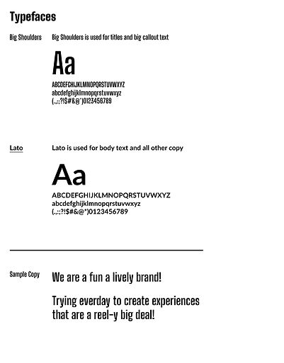
DESIGN
This was the first project I received in college that mimicked the real-world design process that I would later follow. Instead of designing our own app, from scratch, from our own idea, we were given a specific set of instructions and branding guidelines. At first, it felt like half the work had already been done - I didn't have to come up with and test a complimentary color palette or fonts, I didn't have to design a logo, I didn't have to gather a mood board.
Working within these limitations proved to be a challenge on its own, though. I did not have total creative freedom (as, I would later find, you rarely do with actual professional projects), and had to approach the development of the application within very specific boundaries.


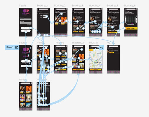
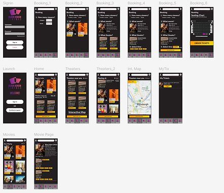
PROTOTYPING
By the time this project came around, I had already found that effective sitemapping was a key part of some of my favorite designs. Easy navigation and cascading organization made for applications and programs that were easy to apply to mental maps and thus, navigate. Pages and parts of the application were easy to find, and the back button was ever-present. Applying these concepts to the process of buying a movie ticket and scheduling seats turned out to be relatively easy (although, today, I would probably have avoided the somewhat garish gradient I chose for the bottom navbar buttons.

bottom of page